 |
| Cheek colour still with shimmer overlay |

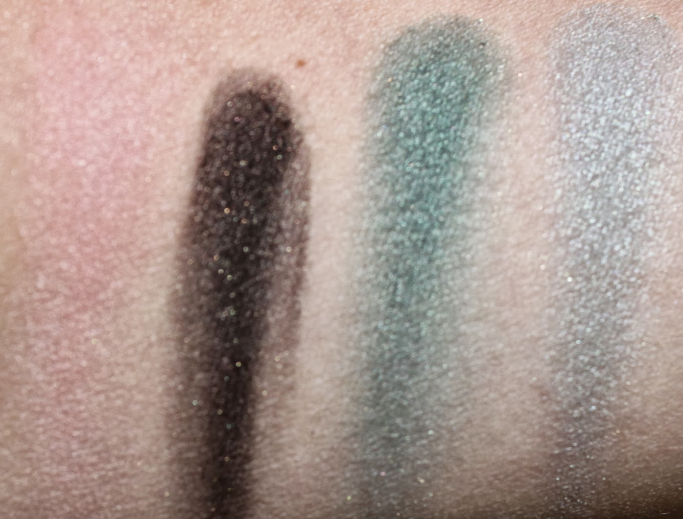
The first shade is a sooty dense bark brown (almost matte) with warm toned reflects. It is not a true duo chrome but does have hints of bronze interlaced with the bark shade.This shade is more complex than the dark shade in Mystic Blue. Perfect for lining the eye. Of course you can add it to you outer v or use as a crease shade. The middle shade is a vibrant forest green with a blue undertone and a satin finish. This colour sold the palette for me. This can be used in the outer v, a liner for the more shy green lover or all over the lid for dramatic effect.The last shade is an icy (not frosty) arctic green that leans blue in different lights. This shade is more shimmery than the other two. Good for the inner eye area or in the crease to help soften the forest green and to blend out. The bark shade and the arctic green could be used as a duo for a more monochromatic look. All three are a contrast in colour and finish. One might find a green palette to be restricting but I do think it is actually quite versatile.
 |
| Angled to show difference in texture in all three shades |
What are your favourite colours to wear on your eyes for fall - do you love or hate a coloured eye and always reach for neutrals?
No comments:
Post a Comment